Usabilityhub (Lyssna) heatmap results
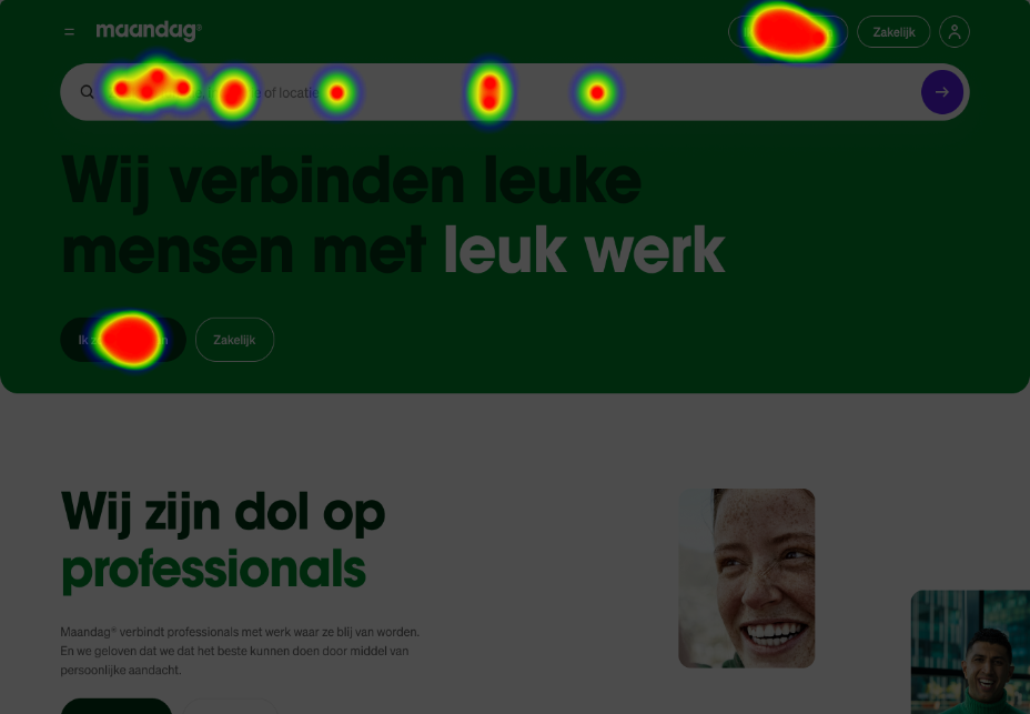
If you are looking for a job, where would you click first?
A prototype for managing living room temperatures, designed to help users save energy by optimizing their schedules.
App to offer junior students their latest exam results for immediate focus, while seniors can trace their study progress over the years for comprehensive growth tracking.
Wireframes for a custom power-user tool designed to streamline the efficient addition of numerous products. Users can input product IDs from printed catalogs or previous orders, leveraging their existing knowledge. Additionally, the tool supports seamless copy-paste functionality from Excel for added convenience
Service and support page with KPI to push for chats over calls. This thing alone save about 5.000 euro a month by reducing calls
My attempt to improve orientation in Figma using a Nintendo Switch controller for its gyroscope and accelerometer readings. It's OK, not great, but it was fun to try it anyway.
My best main navigation to date. That's all I am going to say about it. Trust me. The best part is that there are only two buttons in the top right corner!
Wireframes I used to explain redirects and language suggestions for a localized .com domain to our client, stakeholders, third-party SEO experts, content writers, the marketing team, and multiple development teams.
A streamlined B2B ecommerce cart component that combines multiple item sizes for efficient scanning of large orders, featuring states, micro animations, stock info, and back order options.
If you are looking for a job, where would you click first?
This concept simplifies a pitch to conect Client A with Client B by blending their business strenghts and both make a profit.
I've configured my PlayStation controller to mimic most mouse and keyboard functions, utilizing approximately 290 shortcuts. This setup has been my primary tool for daily tasks at DEPT for three years, up until 2021.
PS: This video has audio so it doesn't auto play
My (short) venture in to crypto world with an income tracker for gamers who earn money by playing P2E games. And yes that's a real thing.
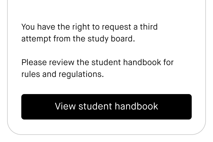
Did a lot for this client. But this is still my proudest part of the app. A few lines of text to inform students they are legally allowed to go to a study board 'examencommissie' and help them in doing so. This has no business benefit for the uni but they did it anyway.
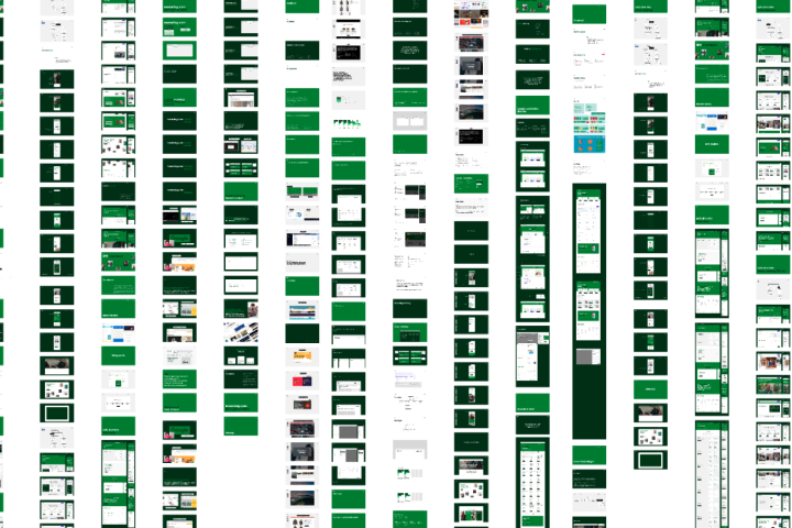
About 950 slides of a project made for 'stakeholder' management purposes. Would take 24 hours to talk you through it. Would do it again.
Inspired by video the streaming of Netflix and the likes I made this but with games and gameplay content instead to make the whole thing more engaging and dynamic.
T9 insprired concept to type with single joystick. This is the keyboard I used to type with the PlayStation controller. It was intended to type short copy like CTA's like 'continue to payment'. This was the only version that I also used to type emails and design documentation with.
Roadside assistance app for a Dutch insurance company. Based on your location we could be 98% sure where you are. But being on the highway or next to it on a parallel road is a world of difference. It took me quite a while to get this final shape and I love it.
Don't judge the visual design—it's from 2011! This animal shelter donation form is a nostalgic favorite of mine.